SCSS
Just changing a SCSS variable you can get your design. Take a look SCSS file structure.
SCSS file structure
src/
└── scss/
    ├── base/
    ├── components/
    ├── framework/
    ├── utilities/
    ├── _init.scss
    ├── _variables.scss
    └── styles.scss
Variables
You assign a value to a name that begins with $, and then you can refer to that name instead of the value itself. But despite their simplicity, they're one of the most useful tools Sass brings to the table. Variables make it possible to reduce repetition, do complex math, configure libraries, and much more.
You can find template variables in _variables.scss file in scss/. Take a look template variables below:
//
// Global variables for Bootstrap customization.
// To override any Bootstrap variable safely and also added necessary theme variables.
//


// Color system
//

// Bootstrap base gray colors
//
// scss-docs-start gray-color-variables
$white:             #ffffff;
$gray-100:          if(isDarkMode(), #1d1e22, #F5F7FA);
$gray-200:          if(isDarkMode(), #202026, #EFF2F5);
$gray-300:          if(isDarkMode(), #34343e, #E4E6EF);
$gray-400:          if(isDarkMode(), #474761, #b2b4b8);
$gray-500:          if(isDarkMode(), #5b5b6a, #8c9095);
$gray-600:          if(isDarkMode(), #6D6D80, #737578);
$gray-700:          if(isDarkMode(), #92929F, #57595b);
$gray-800:          if(isDarkMode(), #CDCDDE, #323334);
$gray-900:          if(isDarkMode(), #FFFFFF, #151719);
$black:             #000000;
// scss-docs-end gray-color-variables

// scss-docs-start gray-colors-map
$grays: (
    "100": $gray-100,
    "200": $gray-200,
    "300": $gray-300,
    "400": $gray-400,
    "500": $gray-500,
    "600": $gray-600,
	"700": $gray-700,
    "800": $gray-800,
    "900": $gray-900
);
// scss-docs-end gray-colors-map

// Bootstrap base theme colors
//
// scss-docs-start color-variables
$blue:      #196eed;
$indigo:    #7551D8;
$purple:    #ad20d4;
$pink:      #DD0A85;
$red:       #E72412;
$orange:    #f7591d;
$yellow:    #f3c848;
$green:     #178037;
$cyan:      #00dee3;
$teal:      #5fe39c;
// scss-docs-end color-variables

// scss-docs-start colors-map
$colors: (
    "blue":       $blue,
    "indigo":     $indigo,
    "purple":     $purple,
    "pink":       $pink,
    "red":        $red,
    "orange":     $orange,
    "yellow":     $yellow,
    "green":      $green,
    "teal":       $teal,
    "cyan":       $cyan,
    "white":      $white,
    "gray":       $gray-600,
    "gray-dark":  $gray-800
);
// scss-docs-end colors-map


// Theme colors
//
// scss-docs-start theme-color-variables
$primary:       $blue;
$secondary:     $gray-600;
$success:       $green;
$info:          $cyan;
$warning:       $yellow;
$danger:        $red;
$light:         $gray-100;
$dark:          $gray-900;
// scss-docs-end theme-color-variables

// scss-docs-start theme-colors-map
$theme-colors: (
    "light":      $light,
    "primary":    $primary,
    "secondary":  $secondary,
    "success":    $success,
    "info":       $info,
    "warning":    $warning,
    "danger":     $danger,
    "dark":       $dark
);
// scss-docs-end theme-colors-map

// scss-docs-start component-color-options
$component-color-options: (
    "red":      $red,
    "green":    $green,
    "blue":     $blue,
    "orange":   $orange,
    "yellow":   $yellow,
    "purple":   $purple,
    "indigo":   $indigo,
    "dark":     $dark
);
// scss-docs-end component-color-options


// Body
//
// Settings for the `` element.
$body-bg:                   if(isDarkMode(), #131416, $white);
$body-color:                $gray-700;
$body-text-align:           left;


// Custom variable to set gutter width in mobile
$grid-gutter-width-sm:      2rem; // 32px


// Links
//
// Style anchor elements.
$link-decoration:           none;


// Typography
//
$font-weight-medium:        500;
$font-weight-semi-bold:     600;

$font-family-base:          'Open Sans', sans-serif;
$font-size-base:            0.875rem; // 14px

$line-height-base:          1.45;

$headings-font-family:      'Roboto Slab', serif;
$headings-font-weight:      700;
$headings-line-height:      1.25;
$headings-color:            if(isDarkMode(), $white, $gray-900);

$h1-font-size:              3rem; // 48px
$h2-font-size:              2.5rem; // 40px
$h3-font-size:              2rem; // 32px
$h4-font-size:              1.5rem; // 24px
$h5-font-size:              1.25rem; // 20px
$h6-font-size:              1rem; // 16px


// Spacing
//
$spacer:        1rem;


//***********************************
//* Theme components
//***********************************


// Avatar
//
// Custom variables
$avatar-title-color:            $gray-800;
$avatar-subtitle-color:         $gray-600;
$avatar-subtitle-font-size:     0.8125rem; // 13px
$avatar-image-border-width:     0.125rem; // 2px
$avatar-image-border-color:     $body-bg;

$avatar-size-base:              2rem; // 32px
$avatar-sizes: (
    sm:     $avatar-size-base * .5,
    lg:     $avatar-size-base * 1.5,
    xl:     $avatar-size-base * 3,
    xxl:    $avatar-size-base * 4,
);


// Badge
//
// Bootstrap variables
$badge-font-size:           0.75rem; // 12px
$badge-font-weight:         $font-weight-semi-bold;
$badge-padding-y:           0.25rem; // 4px
$badge-padding-x:           0.25rem; // 4px

// Custom variables
$badge-icon-font-size:      1rem; // 16px


// Border
//
// Bootstrap variables
$border-radius:             0.375rem; // 6px
$border-radius-sm:          0.25rem; // 4px
$border-radius-lg:          0.5rem; // 8px


// Input & Button
//
// Bootstrap variables
$input-btn-border-width:        0.0625rem; // 1px

$input-btn-padding-y:           0.5rem - $input-btn-border-width;
$input-btn-padding-x:           1rem - $input-btn-border-width;

$input-btn-padding-y-sm:        0.25rem - $input-btn-border-width;
$input-btn-padding-x-sm:        0.75rem - $input-btn-border-width;
$input-btn-font-size-sm:        0.8125rem; // 13px

$input-btn-padding-y-lg:        0.75rem - $input-btn-border-width;
$input-btn-padding-x-lg:        1.25rem - $input-btn-border-width;
$input-btn-font-size-lg:        1rem; // 16px

$input-group-addon-color:       $body-color;
$input-group-addon-bg:          if(isDarkMode(), $gray-300, $gray-200);


// Buttons
//
// Bootstrap variables
$btn-font-weight:               $font-weight-medium;
$btn-line-height:               1.5rem; // 24px

$btn-link-color:                $primary;
$btn-link-hover-color:          $primary;

// Custom variables
$btn-link-font-size:            0.8125rem; // 13px
$btn-link-border-height:        0.125rem; // 4px
$btn-link-padding-bottom:       $btn-link-border-height;

$btn-default-bg:                if(isDarkMode(), $gray-100, $white);
$btn-default-box-shadow:        if(isDarkMode(), 0 0.2rem 0.325rem rgba($black, 0.25), 0 0.125rem 0.25rem rgba($black, 0.1));
$btn-default-hover-box-shadow:  if(isDarkMode(), 0 0.2rem 0.325rem rgba($black, 0.5), 0 0.125rem 0.25rem rgba($black, 0.2));

$btn-icon-child-padding-left:   0.25rem; // 4px


// Input
//
// Bootstrap variables
$input-bg:                      if(isDarkMode(), $gray-100, $white);
$input-color:                   $body-color;
$input-border-color:            $gray-300;

$input-disabled-bg:             $gray-200;

$input-height:                  2.5rem; // 40px
$input-height-sm:               2rem; // 32px
$input-height-lg:               3rem; // 48px


// Form
//
// Bootstrap variables
$form-check-input-width:        1rem; // 16px
$form-check-label-cursor:       pointer;
$form-check-padding-start:      $form-check-input-width + 0.5rem;

$form-check-input-bg:           transparent;
$form-check-input-border:       1px solid $gray-400;

$form-select-indicator-color:   $input-color;
$form-select-indicator:         url("data:image/svg+xml,");

$form-file-button-bg:           $input-group-addon-bg;
$form-file-button-color:        $input-color;
$form-file-button-hover-bg:     mix(white, $form-file-button-bg, 5%);


// Card
//
// Bootstrap variables
$card-bg:                     if(isDarkMode(), $gray-100, $white);
$card-spacer-y:               $spacer;
$card-spacer-x:               $spacer * 1.5;

$card-border-color:           $gray-300;
$card-border-radius:          $border-radius-lg;
$card-box-shadow:             if(isDarkMode(), 0px 0px 1.5rem rgba($black, 0.5), 0px 0px 3rem 0px rgba($gray-900, 0.1));


// Cover
//
$cover-border-radius:               0.5rem; // 8px
$cover-border-radius-lg:            $cover-border-radius * 2;

$cover-head-bg:                     linear-gradient(0deg, rgba($black, 0) 0%, rgba($black, 1) 100%);
$cover-head-padding:                1rem 1rem 2rem;
$cover-head-color:                  $white;
$cover-foot-margin-top:             0.75rem; // 12px
$cover-label-item-margin-left:      0.5rem; // 5px

$cover-image-content-bg:            linear-gradient(0deg, rgba($black, 1) 0%, rgba($black, 0) 100%);
$cover-image-content-color:         $white;
$cover-image-content-padding:       1.5rem 1rem 1rem;

$cover-title-color:                 $gray-900;
$cover-subtitle-color:              $gray-500;
$cover-subtitle-font-size:          0.8125rem; // 13px
$cover-subtitle-font-weight:        if(isDarkMode(), 600, 400);


// Dropdown
//
// Bootstrap variables
$dropdown-box-shadow:			if(isDarkMode(), 0px 0px 1.5rem rgba($black, 0.5), 0px 0px 3rem 0px rgba($gray-900, 0.25));
$dropdown-bg:                   $body-bg;
$dropdown-color:                $gray-700;
$dropdown-border-width:         0;

$dropdown-link-color:           $dropdown-color;
$dropdown-link-hover-bg:        if(isDarkMode(), $gray-100, $gray-200);

$dropdown-link-active-bg:       if(isDarkMode(), $gray-200, $gray-300);
$dropdown-link-active-color:    $gray-800;

$dropdown-item-padding-y:       $spacer * .45;

$dropdown-divider-bg:           $gray-200;

// Custom variables
$dropdown-min-width-md:         14rem; // 208px
$dropdown-min-width-lg:         20rem; // 320px

$dropdown-min-width-sm:         8rem; // 128px
$dropdown-item-padding-y-sm:    $spacer * .25;
$dropdown-item-font-size-sm:    0.8125rem; // 13px


// Dropzone
//
// Custom variables
$dropzone-min-height:           14rem;
$dropzone-padding:              1.5rem 2rem;
$dropzone-border-color:         $gray-300;
$dropzone-border-radius:        $border-radius-lg;


// Navbar
//
// Bootstrap variables
$navbar-padding-y:              1.125rem; // 18px
$navbar-nav-link-padding-x:     1rem; // 16px


// Navs & Tabs
//
// Bootstrap variables
$nav-link-padding-x:            0.5rem; // 8px
$nav-link-color:                $gray-800;
$nav-link-hover-color:          $primary;
$nav-link-disabled-color:       $gray-500;

$nav-tabs-border-color:         $gray-200;
$nav-tabs-link-active-bg:       transparent;
$nav-tabs-link-active-color:    $primary;

// Custom variables
$nav-item-margin-left:          1rem; // 16px
$nav-link-line-height:          1.5rem; // 24px

$mat-nav-line-height:           0.125rem; // 2px
$mat-nav-line-bg:               $primary; // 2px


// List
//
// Bootstrap variables
$list-group-color:                  inherit;
$list-group-bg:                     transparent;

// Custom variables
$list-item-padding:                 0.5rem; // 8px
$list-item-border-radius:           0.25rem; // 4px
$list-item-hover-bg:                $gray-100;

$list-cover-border-radius:          0.25rem; // 4px
$list-cover-size:                   3rem; // 48px

$list-child-padding-left:           1rem; // 16px
$list-options-item-margin-left:     1rem; // 16px

$list-title-color:                  $cover-title-color;
$list-title-margin-bottom:          0.125rem; // 2px
$list-subtitle-color:               $cover-subtitle-color;
$list-subtitle-font-size:           $cover-subtitle-font-size;
$list-subtitle-font-weight:         $cover-subtitle-font-weight;
// List size
$list-item-border-radius-lg:        0.5rem; // 8px

$list-cover-border-radius-lg:       0.5rem; // 8px
$list-cover-size-lg:                4rem; // 64px

$list-order-font-size:              1rem; // 16px
$list-order-width:                  2.5rem; // 40px
$list-order-padding-left:           0.5rem; // 8px

$info-list-spacing-x:               2rem; // 32px
$info-list-dot-size:                3px;


// Modal
//
// Bootstrap variables
$modal-content-bg:                  $body-bg;
$modal-content-border-width:        0;

$modal-header-padding-x:            1.5rem; // 24px
$modal-header-border-color:         $gray-200;
$modal-header-border-width:         1px;


// Pagination
//
// Bootstrap variables
$pagination-padding-y:              0.625rem; // 10px
$pagination-min-width:              2.25rem; // 36px
$pagination-color:                  $gray-900;
$pagination-bg:                     transparent;
$pagination-border-color:           transparent;
$pagination-margin-start:           $spacer * .5;

$pagination-focus-color:            $pagination-color;
$pagination-focus-bg:               $gray-200;

$pagination-hover-color:            $pagination-color;
$pagination-hover-bg:               $gray-200;
$pagination-hover-border-color:     transparent;

$pagination-active-border-color:    transparent;

$pagination-disabled-bg:            transparent;
$pagination-disabled-border-color:  transparent;


// Progress
//
// Bootstrap variables
$progress-bg:                       if(isDarkMode(), $gray-300, $gray-200);


// Snackbar
//
// Custom variables
$snackbar-bg:                       #1d1e22;
$snackbar-border-radius:            0.25rem; // 4px
$snackbar-padding-y:                0.75rem; // 12px
$snackbar-margin:                   1rem 2rem;
$snackbar-line-height:              1.25rem; // 20px


// Swiper
//
// Custom variables
$swiper-navigation-size:                    2.5rem; // 40px
$swiper-navigation-icon-size:               1rem; // 16px
$swiper-pagination-margin-top:              2rem; // 32px
$swiper-pagination-bullet-width:            1.5rem; // 24px
$swiper-pagination-bullet-height:           0.25rem; // 4px
$swiper-pagination-bullet-border-radius:    1px;


// Scroll
//
// Custom variables
$scroll-size:               0.25rem; // 4px
$scroll-spacing:            0.25rem; // 4px
$scroll-bg:                 $gray-400;
$scroll-rail-bg:            $gray-300;


// Switch
//
// Custom variables
$switch-width:              3rem; // 48px
$switch-height:             1.5rem; // 24px
$switch-bg:                 $gray-300;

$switch-thumb-bg:           $gray-500;
$switch-thumb-active-bg:    $primary;
$switch-thumb-spacing:      0.5rem; // 5px
$switch-thumb-box-shadow:   0 0.125rem 0.5rem 0 rgba($black, 0.15); // 5px


//***********************************
//* Theme frameworks
//***********************************

// Common variables
//
$brand-width:                   6.5rem; // 104px
$brand-height:                  2.75rem; // 44px

$icon-size-base:                1.5rem; // 24px

$feature-icon-size:             3rem; // 48px

$newsletter-border-radius:      1rem; // 24px
$newsletter-padding:            3rem 2rem;
$newsletter-border-radius-sm:   1.5rem; // 24px
$newsletter-padding-sm:         5rem 4rem;
$newsletter-bg:                 $primary;
$newsletter-color:              $white;
$newsletter-btn-min-width:      14rem; // 240px

// scss-docs-start transition-variables
$transition-short:              all .15s ease-in-out;
$transition-medium:             all .35s ease-in-out;
$transition-large:              all .75s ease-in-out;
// scss-docs-end transition-variables


// Z index
//
// scss-docs-start zindex-variables
$zindex-player:         1000;
$zindex-backdrop:       1001;
$zindex-header:         1002;
$zindex-sidebar:        1003;
$zindex-line-loader:    1004;
$zindex-loader:         1100;
// scss-docs-end zindex-variables


// Loader
//
$loader-bg:                 $body-bg;
$loader-color:              $dark;
$loader-letter-spacing:     1px;
// Loader equalizer
$loader-eq-size:            2rem; // 32px
$loader-eq-padding:         0.25rem; // 4px
$loader-eq-border-width:    0.125rem; // 2px
$loader-eq-border-height:   100%;

// Line loader
$line-loader-bg:            $primary;
$line-loader-height:        0.25rem; // 4px


// Sidebar
//
$sidebar-bg:                                $gray-100;
$sidebar-width:                             17.5rem; // 280px
$sidebar-padding-x:                         1.5rem; // 24px
$sidebar-head-padding:                      1.5rem 1rem 3rem;
$sidebar-head-padding-top-sm:               1rem; // 16px
$sidebar-foot-padding:                      2rem $sidebar-padding-x 1rem;
$sidebar-toggler-color:                     $gray-900;

$sidebar-nav-link-padding:                  0.625rem $sidebar-padding-x;
$sidebar-nav-link-color:                    $gray-800;
$sidebar-nav-link-border-width:             0.25rem; // 4px

$sidebar-nav-link-active-color:             $primary;
$sidebar-nav-link-active-bg:                linear-gradient(90deg, rgba($sidebar-nav-link-active-color, 0.1) 0%, rgba($sidebar-nav-link-active-color, 0) 100%);

$sidebar-nav-item-head-color:               $gray-500;
$sidebar-nav-item-head-padding:             1.5rem $sidebar-padding-x 1rem;

$toggle-sidebar-width:                      4.5rem; // 72px
$toggle-sidebar-foot-padding-x:             ($toggle-sidebar-width - ($icon-size-base + ($input-btn-border-width + $input-btn-padding-y) * 2)) * .5;


// Page content
//
$page-content-padding-x:                    1.25rem; // 20px


// Backdrop
//
$backdrop-bg:                               rgba($black, 0.7);
$backdrop-filter:                           blur(0.125rem);


// Header
//
$header-padding:                            1rem $page-content-padding-x 0;
$header-container-bg:                       $primary;
$header-container-padding-y:                0.5rem; // 8px
$header-container-padding-x:                1.5rem; // 24px
$header-container-padding-x-sm:             1rem; // 16px
$header-container-border-radius:            0.375rem; // 6px
$header-container-box-shadow:               if(isDarkMode(), 0px 1px 1rem 0px rgba($black, 0.25), 0px 1px 2rem 0px rgba($black, 0.3));


// Search
//
$search-bg:                                 $body-bg;
$search-color:                              $body-color;
$search-max-height:                         20rem; // 320px
$search-margin-top:                         0.5rem; // 8px
$search-border-radius:                      1rem; // 16px
$search-box-shadow:                         if(isDarkMode(), 0px 1px 1rem 0px rgba($black, 0.1), 0px 1px 2rem 0px rgba($black, 0.2));

$search-padding-y:                          1rem; // 16px
$search-padding-x:                          $header-container-padding-x;
$search-padding-x-sm:                       $header-container-padding-x-sm;

$search-head-border-width:                  1px;
$search-head-border-color:                  $gray-200;
$search-head-btn-margin:                    0.25rem; // 4px

$search-title-color:                        $gray-900;
$search-title-font-size:                    1rem; // 16px

$search-input-padding-right:                2rem; // 32px


// Hero
//
$hero-height:                       20rem; // 320px
$hero-bg:                           linear-gradient(0deg, rgba($body-bg, 1) 0%, rgba($body-bg, 0.25) 100%);

$main-hero-min-height:              34rem; // 544px
$main-hero-max-width:               100rem; // 1600px
$main-hero-border-radius:           1.5rem; // 24px
$main-hero-padding:                 2.5rem 0.5rem;
$main-hero-padding-sm:              4rem 2rem;
$main-hero-padding-lg:              4rem; // 64px
$main-hero-color:                   #151719;
$main-hero-btn-min-width:           10rem; // 160px


// Section
//
$section-margin-bottom:             $spacer * 4;
$section-head-margin-bottom:        $spacer * 2;

$section-subtitle-font-size:        0.75rem; // 12px
$section-subtitle-color:            $gray-600;
$section-subtitle-margin-bottom:    $spacer * .25;

$main-section-padding-y:            4rem; // 64px
$main-section-padding-y-sm:         6rem; // 96px


// Plan
//
$plan-padding:                      2rem 0 2rem 2rem;
$plan-border-radius:                1rem; // 16px

$plan-info-bg:                      if(isDarkMode(), $gray-300, $white);
$plan-info-spacing:                 1.5rem; // 24px
$plan-info-spacing-sm:              2rem; // 32px
$plan-card-border-color:            $gray-300;
$plan-data-padding-x:               2rem; // 32px
$plan-data-margin-y:                2rem; // 32px


// Player
//
$player-color:                      $gray-900;
$player-padding:                    0 $page-content-padding-x 1rem;

$player-container-bg:               $body-bg;
$player-container-height:           4.5rem; // 72px
$player-container-border-radius:    0.5rem; // 8px
$player-container-box-shadow:       if(isDarkMode(), 0px 1px 1rem 0px rgba($black, 0.5), 0px 1px 2rem 0px rgba($black, 0.3));

$player-progress-bg:                $primary;
$player-progress-height:            0.125rem; // 2px
$player-progress-thumb-size:        0.75rem; // 12px
$player-progress-thumb-bg:          $primary;

$player-btn-active-color:           $primary;
$player-btn-default-bg:             $primary;

$player-volume-width:               0.25rem; // 4px
$player-volume-height:              6rem; // 96px
$player-volume-bg:                  $gray-900;
$player-volume-border-radius:       1px;

$player-volume-thumb-size:          0.75rem; // 12px
$player-volume-thumb-bg:            $player-volume-bg;
$player-volume-thumb-box-shadow:    0 1px 0.125rem 0px rgba($black, 0.5);

$player-volume-dropdown-width:      $player-volume-width + 2.25rem;
$player-volume-dropdown-height:     $player-volume-height + 2rem;

$player-info-padding-right:         1rem; // 16px


// Playlist
//
$playlist-width:                    25rem; // 400px
$playlist-height:                   30rem; // 560px
$playlist-padding-x:                1.5rem; // 24px
$playlist-padding-y:                1rem; // 16px

$playlist-head-btn-font-size:       0.75rem; // 12px
$playlist-head-btn-line-height:     1.35;


// Footer
//
$footer-padding-top:                2rem; // 32px
$footer-padding-bottom:             8rem; // 128px
$footer-bg:                         url(../images/background/footer.jpg) center no-repeat;
$footer-overlay-bg:                 linear-gradient(0deg, rgba($body-bg, 0.8) 0%, rgba($body-bg, 1) 100%);

$app-btn-min-width:                 10.5rem; // 168px
$app-btn-min-width-xs:              15rem; // 240px

$main-footer-padding-y:             4rem; // 64px
$main-footer-padding-y-sm:          6rem; // 96px
$last-footer-border-color:          $gray-300;

$social-item-margin-left:           0.75rem; // 12px
$social-link-color:                 $gray-900;
$social-link-hover-color:           $primary;


// Auth
$auth-min-height:                   100vh;
$auth-or-max-width:                 15rem; // 240px
$auth-or-border-color:              $gray-300;
$auth-or-content:                   'or';
$auth-or-padding:                   0 0.5rem;
When making any changes to the Sass variables or maps, you’ll need to save your changes and recompile. For that please refer ng build
HTML
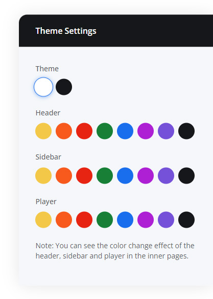
Customization through HTML is very easy just adding a predefine attribute on body you can get dark mode.
Dark mode
Adding data-theme="dark" on the body.
<body data-theme="dark">
    <!-- Content here -->
</body>
Component colors
We are included 8 colors blue, indigo, purple, red, orange, yellow, green, and dark for the main components of the template. To adding predefine attribute get your color. Open respective component from view/layout/ folder.
<header id="header" data-header="*color">
    <!-- Content here -->
</header>

<aside id="sidebar" data-sidebar="*color">
    <!-- Content here -->
</aside>

<div id="player" data-player="*color">
    <!-- Content here -->
</div>
Typescript
You can also change the theme and components skin by using Typescript code. Open constant.ts file from the core/constants/.
// Enable for theme dark mode
public static DARK_MODE = false;

// Components theme :: ['yellow', 'orange', 'red', 'green', 'blue', 'purple', 'indigo', 'dark']
public static HEADER_THEME = 'blue';
public static SIDEBAR_THEME = 'blue';
public static PLAYER_THEME = 'blue';
Settings
Settings is a just to showing template changes if you want to remove this open constant.ts file from the core/constants/ and set SETTINGS_VIEW = false.
/// Flag to show theme setting options
public static SETTINGS_VIEW = true;